Follow Up Boss team reports that disagree: how to find the split and fix it
When two Follow Up Boss reports disagree about the same deal, the cause is usually definition drift: each view computes its own stage, owner and dollar figure. Fix it by writing a one-sentence definition for every shared metric, naming one person who owns that definition, and deleting the duplicate view instead of reconciling it.

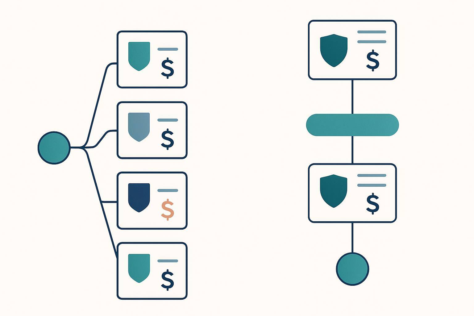
One number in our own admin dashboard — estimated commission at risk — was rendering on five separate screens, with two different definitions behind it and three different values on the page. A team lead who opened two of those five in the same minute had no way to tell which one was lying.
We found it in an internal critic pass in early July, not from a support ticket, which is its own uncomfortable detail: customers had been looking at it for weeks. Response time was worse — four screens, four values, three different names for the same idea. The fix was not a bug fix. It was a change to how a number is allowed to reach a screen at all.
Below is what causes this, a twenty-minute audit you can run on your own Follow Up Boss reporting today without buying anything, and what we changed. Also, at the end, the part this does not fix.
Why two reports disagree about the same deal
Two reports disagree when each one computes the number itself. Nothing is broken and nobody made a mistake — each view is internally correct and reads a slightly different definition. The disagreement is structural, so it survives every round of "let's just double-check the data," and it comes back the week after you reconcile it by hand.
Three causes account for most of it.
1. Every view does its own math
A pipeline report sums commission on open deals. An at-risk report sums commission on deals past their projected close. A team report sums commission on deals owned by flagged agents. Same word on all three tiles. Three different sets. Nobody wrote a shared definition down, so three developers — or three Smart List authors — each invented a reasonable one.
2. The same word, two denominators
"Close rate" is the worst offender in real estate reporting, because it has at least two honest meanings. Divide closings by every lead that ever entered the pipeline and you get one number. Divide won deals by deals that actually reached a decision — won or lost — and you get a very different one. Both are real. Neither is "the" close rate.
We ban the bare phrase in our own dashboard for exactly this reason: the two metrics ship under the explicit names Lead → Closed % and Deal win rate, each with its denominator written into the shared definition behind the name. If your team argues about conversion and nobody has said the denominator out loud, you are not arguing about performance.
3. Different windows wearing the same label
"Leads waiting" right now and "leads waiting" averaged over the last 30 days are different questions. A point-in-time count and a rolling-window count will never match, and they should not. What breaks trust is when they share a label and sit two clicks apart. Every metric needs its window stated where the number is, not buried in a docs page nobody opens.
The cost is not confusion. It is that nobody acts.
The failure mode here is quieter than a wrong number. A team lead who has been burned twice by a queue stops opening the queue.
Clinical medicine has measured this carefully, and the numbers are grim in a way that should be familiar. In a review of clinical decision support alerts, McCoy and colleagues found clinicians override 49% to 96% of alerts, and cite a study where clinicians received 56 alerts a day and spent 49 minutes a day processing them (Ochsner Journal, 2014). The stated cause is signal-to-noise: alerts that repeat, or are not relevant, train people to dismiss the ones that are. A CRM dashboard that contradicts itself is the same machine with lower stakes.
The data industry has arrived at the same place from the other direction. In dbt Labs' 2026 State of Analytics Engineering survey of 363 data practitioners and leaders, the share who called increasing trust in data an important priority jumped from 66% to 83% in a year, 41% named ambiguous data ownership as a persistent obstacle, and 71% said they were worried about incorrect data reaching stakeholders (dbt Labs, April 2026). Ambiguous ownership is the one to sit with. Most reporting splits are not a math problem. They are a question of who is allowed to decide what a word means.
The 20-minute audit
Run this on your own Follow Up Boss stack — built-in reports, Smart Lists, exported spreadsheets, whatever your team actually opens. It costs nothing.
- Pick one deal that matters. Not a sample record. A live one, mid-pipeline, with real money on it.
- Open every report that mentions it and write down four things from each: the stage, the owning agent, days since last activity, and the dollar figure. One row per report.
- Circle every column where two rows differ. That is your split. It is usually one or two columns, not all four.
- For each split, find where the number is computed — a Smart List filter, a report setting, a spreadsheet formula, a vendor's black box.
- Write one sentence per metric. Source field, denominator, time window. "Deal win rate = won deals ÷ (won + lost) deals, last 30 days, from FUB deal stage." If you cannot write the sentence, that is the finding.
- Name one owner per definition — a person, not a team. This is the step everyone skips. It is also the one 41% of dbt's respondents named as a persistent obstacle, and those are teams with dedicated data staff.
- Delete the duplicate view. Do not reconcile it. A second view of the same metric is a promise you will have to keep every quarter forever.
What you are looking for, concretely:
| Check | The question to ask | What a failure looks like |
|---|---|---|
| Denominator | Percent of what? | A tile labeled "close rate" with no stated base |
| Window | Right now, or averaged over how long? | Two tiles, same label, one live and one 30-day |
| Owner field | Which FUB field decides who owns this? | Assigned user on one report, deal owner on another |
| Empty state | Does zero mean zero, or mean "no data"? | A confident $0 where the query actually returned nothing |
| Estimate labeling | Is this measured or modeled? | A projected figure shown with no "(est.)" on it |
| Definition owner | Who decides what this word means? | Nobody can name a person |
The empty-state row catches more real damage than it looks like it should. A dashboard that renders $0 when it means "we could not compute this" is worse than one that renders nothing, because the zero is actionable and wrong. If you are rebuilding team reporting from scratch, our guide to performance reporting in Follow Up Boss walks the built-in reports one at a time, and this shorter piece on team performance reports covers the Reporting tab and the Smart Lists worth wiring to it.
What we changed after finding it in our own product
Two structural fixes, both boring, both load-bearing.
One catalog of definitions. Every shared metric now has exactly one frozen entry — label, plain-English definition, format, and whether it is point-in-time or windowed — and every admin view reads from it. "GCI at risk (est.)" is one label with one definition, sized from the account's own median commission per won deal once there is enough closed history to trust that median, and from a default before then. There is also a test that walks every screen in the dashboard and fails the build if a developer types a shared metric's label by hand instead of reading it from the catalog. That test is the actual fix. The catalog without it would have drifted again inside a quarter.
One risk row per entity. A person or deal at risk is built once, by one function, and both the Ace Trove Command Center queue and the Pipeline bottleneck view render that same row: same stage, same owning agent, same days idle, same reason string, same dollars. Where an alert and a risk row cover the same person, the alert's reason wins and the risk row contributes the dollar figure — a precedence rule written down once instead of decided twice. Rows the funnel could not match to a real risk row keep the funnel's own estimate and are labeled "stage-model (est.)" on the screen, because an honest label beats a confident guess.
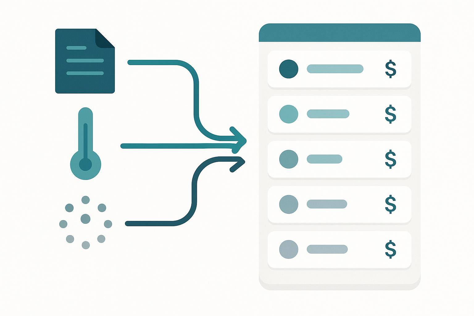
The visible result is one screen instead of four. Command Center pulls three pillars — deals stalled past a stage or milestone threshold, leads breaching your response SLA or sitting 30+ days without contact, and past clients silent for six months or more — into a single queue you can sort by estimated dollars at risk. The old standalone Revenue Guard screen no longer exists; its URL redirects into that sort. We deleted it rather than keeping both, which is step seven of the audit above applied to ourselves.
Two adjacent pieces are worth reading if the mechanics interest you: how we attribute each activity to the deal it is pushing (this is what makes "days idle" mean something on a deal rather than a person), and how the underlying scores are calibrated against real closings.
What this does not fix
Consistency is not accuracy. A single definition can be consistently wrong on every screen, and it will now be wrong with more authority. Getting the number right is a separate job, and the audit above will not do it for you.
Estimates stay estimates. "GCI at risk (est.)" is a modeled figure sized from your own closed-deal history — a way to rank a queue by consequence, not a forecast of money you are about to lose. Anyone selling you a precise dollar figure for pipeline risk is selling you a rounded number with a decimal point on it. We wrote about the same honesty problem in ROI math.
Bad stage hygiene defeats all of it. If half your team marks deals Under Contract when they mean Offer Submitted, no shared definition rescues that; you get consistent, well-formatted nonsense. Stage discipline is a management problem first, and CRM adoption is where it starts — we covered getting a team to actually use Follow Up Boss, and how to structure the stages themselves, separately.
And Command Center is not an agent tool. It answers who on the team needs attention and where the risk is concentrated, which is a team lead and admin question. Agents get a per-person queue in the Companion instead. Trove is a paid account-wide add-on on top of a Follow Up Ace subscription — the twenty-minute audit is not, and it is the part that matters most.
The one question worth asking in your next team meeting
Pick your most-quoted number. Ask two people on your team to define it out loud, separately, in one sentence each.
If the sentences do not match, you have found the split, and you did it in ninety seconds. If they do match, ask who gets to change that definition. That answer is usually the harder one.
Try Follow Up Ace in your Follow Up Boss
Free to start, no sales call. Connect Follow Up Boss in one click and Ace works inside your CRM.
Get Started Free