CRM Dashboard Audit: 7 Signs Your Numbers Are Lying
Audit any CRM dashboard number by asking what it counted. Seven silent failures do most of the damage: a page limit printed as a total, a capped worklist called your whole book, a constant dressed as a measurement, a filter that excludes nobody, a failed job that reads as improvement, a zero meaning unknown, and one label with two meanings.

A daily brief we generate reported 100 active contacts, 100 warm contacts and 100 overdue tasks. Same number three times, on a book of 12,460 people. The account's real overdue count was around 530.
No dataset produces that. It is what a single page of API results looks like when somebody counts the rows and prints the answer under the word "total." Follow Up Boss caps every list request at 100 records and hands back the true count in the response metadata. We were counting the rows and ignoring the count.
That is one of seven ways a dashboard number can be wrong while looking completely normal. We found all seven in our own product this summer and fixed them. None is unique to us — they come from ordinary engineering shortcuts, so some version is sitting in a tile of whatever stack you run.
Why a wrong number is worse than no number
An empty tile makes you go look. A confident wrong tile makes you act.
That second half is measured. In an incentivized behavioral experiment, Klingbeil and colleagues found that merely knowing advice came from an AI led people to follow it even when it contradicted the context in front of them and their own judgment (Computers in Human Behavior, 2024). A number on a screen collects the same deference. Team leads coach agents on these tiles and cut seats on them, so a fabricated row in a performance view is somebody's quarter.
The seven failure modes
1. A page limit printed as a total
Looks like: several unrelated counts on one screen are the same round number. 100 leads, 100 tasks, 100 anything. Or 50, or 25, or 250.
Happens because: almost every CRM API paginates. The code asks for one page, gets an array, reports its length. The real total was sitting in the same response the whole time.
Test: reproduce the count by hand — a saved filter, a smart list, an export. If the tile says 100 and the list says 530, you found it. Any figure that exactly equals a common page size earns this check before you trust it.

2. A capped worklist described as your whole book
Looks like: a count or dollar figure that will not grow past a ceiling however far the underlying situation slides.
Happens because: caps are usually correct. Our Revenue Guard tile sizes commission at risk across four pillars, and three return their top 50 most salvageable records — 50 rows is a worklist you can work, thousands is a wall. The cap was fine. Calling the sum "one account-wide number" was not. On live accounts the cold-lead pillar sat at exactly 50 rows.
Test: watch the number over a few weeks. If it parks on one value while the thing it measures visibly changes, it is capped — then read the tooltip and see whether the product admits it. Ours now names which pillars are capped, which is a complete count, and states that a pillar sitting at the cap is a floor.
3. A constant wearing a measurement's clothes
Looks like: a health or coverage percentage reading 100%, or 0%, that has never read anything else.
Happens because: a status pill fell back to a hardcoded 100 once an initial setup step was marked complete. A team whose CRM authorization lapsed months later still read "field coverage: 100%" — the exact question the pill exists to answer, answered with a literal.
Test: list the numbers that have moved in the last quarter, then the ones that haven't. The second list is where you start asking. Ours now shows an em dash when no live reading is available — uglier, and true.
4. A filter that excludes nobody
Looks like: "21 of 21 seats active," sitting directly beside "Agents flagged: 21." The same 21 people, described two ways.
Happens because: a seat that has never done anything has no last-active date, so the code substitutes a default — the length of the reporting window. The filter asks whether that value falls inside the window, and it always does. Every dormant seat passes the activity test, and the dormant list comes back empty, because the same default fails that comparison too.
Test: find the count that never excludes anyone. If "active users" equals "total users" every week on a team where two people demonstrably haven't logged in since spring, the filter is decorative. Adjacency is the tell.
5. A failed job that reads as an improvement
Looks like: a score moves in your favour overnight and nobody did anything.
Happens because: this is the nastiest one. Three of the four Revenue Guard sweeps were wrapped so a failure returned an empty result instead of an error, and an empty risk pillar scores as perfectly healthy. A database timeout on a large scan therefore raised book health and lowered commission at risk, leaving no marker anywhere. The zeroed figure then entered stored history and came back as trend data.
Test: when a metric improves and you cannot name the cause, treat it as an alert. Ask your vendor what the dashboard shows when a source is unreachable — "the last good value" and "zero" are very different answers, and only one is honest. A failed pillar in ours now returns nothing, marks the reading partial, names which pillar broke, and never reaches history.

6. A zero that means "we don't know"
Looks like: $0 where the honest answer is a dash.
Happens because: a running total starts at zero and only accumulates when its inputs exist. With no inputs, a real zero reaches the currency formatter and renders as "$0." Our Back Office pipeline tile did this: the team headline said the pipeline was worth $0 while the per-agent rows directly below it, guarding the identical value, rendered a dash. One screen, two answers, and the dollar figure was the false one.
Test: hunt zeros and ask which kind each is. A measured zero and a missing zero look identical and mean opposite things. Where the same value appears twice with different treatment, that disagreement is your shortcut to the truth.
7. One label, two meanings
Looks like: two surfaces, same words, different numbers, both internally consistent.
Happens because: two teams implemented "at-risk value" at different times. One meant gross sale price. One meant the commission actually earned. In real estate that gap is not rounding — list price overstates commission exposure by roughly thirty to forty times. A tool of ours titled around commission exposure was forwarding the sale-price sum, one file away from a written warning saying exactly that.
Test: take one deal you know cold and trace its contribution through every report claiming to include it — the longer version is in why two Follow Up Boss reports disagree about the same deal. It often starts upstream: Follow Up Boss flags won stages with one checkbox and flags nothing else, so "Closed Lost" contains the word closed and every report downstream has to guess.
The 20-minute audit
Run this against any dashboard you make decisions with, ours included. Take your five most-used tiles through each row.
| Check | What you're asking | A bad answer |
|---|---|---|
| Reproduce it | Can I rebuild this count by hand in the CRM? | Off by a round number like 100 or 50 |
| Move it | Has this value changed in the last quarter? | It has only ever shown one value |
| Cap it | Does it stall at a ceiling while reality worsens? | It parks and the tooltip says nothing |
| Exclude someone | Does this filter ever leave anyone out? | The filtered count equals the total, always |
| Break it | What shows when the source is down? | Zero, or the metric silently improves |
| Read the zero | Is this zero measured or missing? | The product can't tell you which |
| Trace one record | Does one deal count the same in every report? | Two surfaces, same label, different math |
Five tiles, seven questions, one afternoon. If a vendor cannot answer "what does this show when the data source is unreachable," you have learned something more useful than the number.
What an honest tile looks like
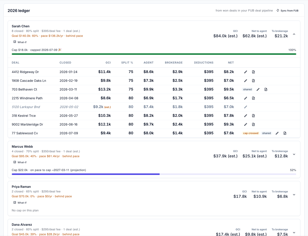
Three habits carry most of the weight, and you can demand all three from any vendor:
- Label the estimates. Anything modeled reads "(est.)" and never sits beside a measured figure without the distinction visible.
- Never invent a number to avoid an empty state. A dash is a legitimate answer. A fabricated zero or a placeholder row is not.
- Put the scope in the tooltip. "Top 50 per pillar, so a pillar at the cap is a floor" costs one sentence and prevents a class of wrong decision.
That last habit has research behind it. Kupfer and colleagues found that decision-makers who had been told the system could err checked its output harder — and across the study, more checking went with objectively better picks. People shown the most heavily aggregated view spent less time on it (Frontiers in Psychology, 2023). Telling users where a number is soft makes them better users of it.
What we still get wrong
Three things, because a post like this is worthless if it only lists solved problems.
The caps are still there. We label them now; we did not lift them. Revenue Guard still contributes its top 50 records per pillar and the health score still stops moving once a pillar saturates. That is a deliberate cost and usability decision, and the honest version of it is a sentence in the tooltip, not a claim that we solved it.
We fixed the gross-versus-commission label in one place and then found the same phrasing still live in a second, on a different surface. As of publication that one is not corrected. These defects travel in families, and shipping the first fix is how you find the rest.
And most of the seven were caught by an internal audit rather than by anyone noticing — so they were live, quietly wrong, longer than we would like. Two surfaced only because a real account's numbers were impossible on their face. The other five nobody would ever have flagged, because a plausible wrong number is invisible from outside. Which is the argument for running the audit above rather than waiting for something to look strange.
Where this fits in a reporting routine
Once the tiles are trustworthy, the review work is a separate discipline: start with our real estate KPI checklist for Follow Up Boss users and the guide to performance reporting in Follow Up Boss. Scope errors do their most expensive damage in pipeline forecasting.
If you build against the CRM yourself, the pagination trap in failure mode one is the most common integration bug we see; our Follow Up Boss API integration guide covers reading the real total rather than the page length. Ace Trove is the intelligence layer these tiles belong to, and free Follow Up Boss accounts now see their own real numbers on tiles that used to show sample data.
Frequently asked questions
How do I know if a CRM dashboard number is wrong?
Reproduce it by hand in the CRM. If the dashboard says 100 and a filtered list says 530, it reported one page of results as a total. Then check whether the value has ever changed, and what it displays when a data source is unavailable.
Why do two reports in the same product show different numbers?
Usually definition drift: two teams implemented the same label at different times with different math. In real estate the common split is gross sale price versus earned commission — roughly thirty to forty times apart, not a rounding difference. Trace one known deal through every report claiming to include it.
Is a zero on a dashboard ever a real measurement?
Often, which is the problem. A measured zero and a missing value render identically unless the software distinguishes them. A well-made dashboard shows a dash for unknown and reserves zero for a genuine count of none. Where one screen shows $0 and another a dash for the same figure, the dash is usually right.
What should I ask a CRM vendor about their reporting?
Three questions: what scope does this number cover, is it a measurement or a model, and what does it display when the underlying data is unreachable? A vendor who cannot answer the third has probably shipped a failure that reads as an improvement.
Try Follow Up Ace in your Follow Up Boss
Free to start, no sales call. Connect Follow Up Boss in one click and Ace works inside your CRM.
Get Started Free